
With the recent launch of SysTrack 7.0 it’s a perfect time to introduce one of the newest (and best, in my opinion) features: SysTrack Dashboard Builder. Even though it’s currently still just a tech preview it’s fairly feature complete, and there are some cool ways to present and customize data from SysTrack or other sources.
The basic idea is to build a dashboard from some component pieces. You start with a set of data you’d like to work with (e.g. software utilization, health, vCenter system stats, etc. . .), and use this to create a query with the report builder. This then gets connected to a series of presentation tools. You can pick from standard (boring) tabular views, charts of a number of types, heat charts, bubble diagrams, and basically any way you’d care to think of to show some data points.
How to create a software inventory dashboard
To illustrate the process we’ll go step by step through the creation of a basic software inventory dashboard.
The first step is to create a new dashboard.
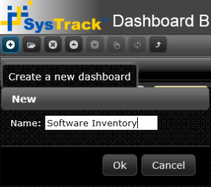
Give it a name (I’ll pick Software Inventory because I’m not a very creative person), and then we’re ready to start dragging objects in. I’ll start with the Query object:
There are some key areas here:
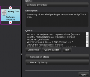
- Name and Description – Yep
- Query – This is the critical part of the dashboard, and the heart of the entire process. There are a few options (we’ll explore more in later posts), but because I’m pretty familiar with the data we’re working with here I’ll just put together a quick query (we’ll cover the report builder later, but it’s pretty easy to work with):
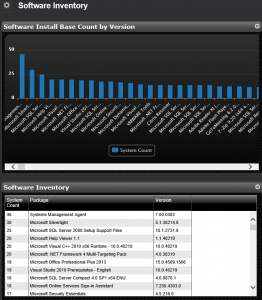
SELECT COUNT(DISTINCT SystemId) AS [System Count], PackageName AS [Package], Version
FROM RPT_Software
WHERE (Flags & 16) = 0 AND Version <> ''
GROUP BY PackageName, Version
ORDER BY COUNT(DISTINCT SystemId) DESC- Connection String – Here an alternative data source can be specified.
- Hierarchy Setup – Basically a method for developing groupings within the datasets. This will also be covered later.
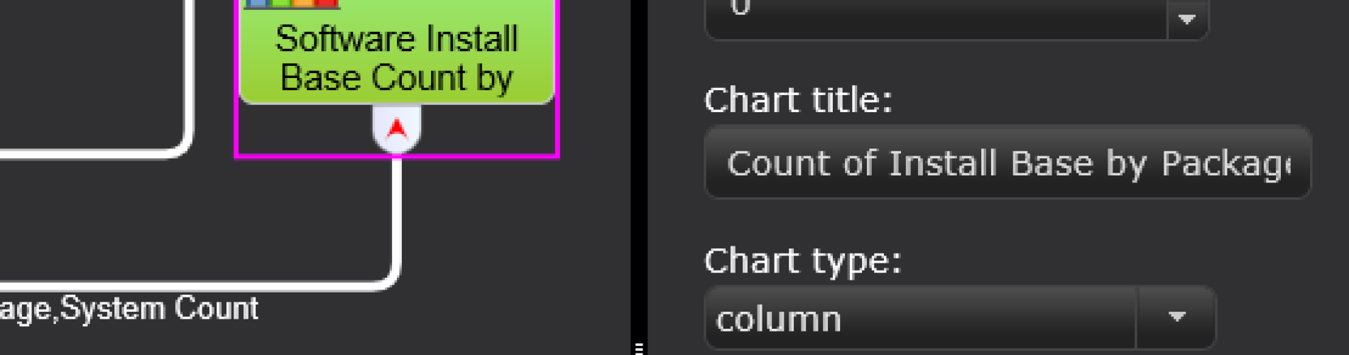
With this, we’re ready to add in some objects to view the data. I’ll pick a table and a bar chart:
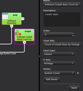
By dragging in the presentation objects and connecting them to the data source I’ve finished up a basic dashboard. From here I can specify some settings for my chart (column type, what appears on the X-axis, what the title is) and save. This is now a complete dashboard ready for use:
With that we’ve completed a very rudimentary dashboard. We’ll have some more blogs covering much more detailed nuances of how to work with the Dashboard Builder in the near future, but that’s all it takes to get started. Give it a shot.


Subscribe to Lakeside Updates
Receive product updates, DEX news, and more