
With the recent launch of SysTrack 7.0 it’s a perfect time to introduce one of the newest (and best, in my opinion) features: SysTrack Dashboard Builder. Even though it’s currently still just a tech preview it’s fairly feature complete, and there are some cool ways to present and customize data from SysTrack or other sources.
The basic idea is to build a dashboard from some component pieces. You start with a set of data you’d like to work with (e.g. software utilization, health, vCenter system stats, etc. . .), and use this to create a query with the report builder. This then gets connected to a series of presentation tools. You can pick from standard (boring) tabular views, charts of a number of types, heat charts, bubble diagrams, and basically any way you’d care to think of to show some data points.
To illustrate the process we’ll go step by step through the creation of a basic software inventory dashboard.
The first step is to create a new dashboard.

Give it a name (I’ll pick Software Inventory because I’m not a very creative person), and then we’re ready to start dragging objects in. I’ll start with the Query object:
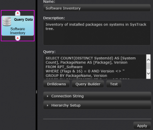
There are some key areas here:
- Name and Description – Yep
- Query – This is the critical part of the dashboard, and the heart of the entire process. There are a few options (we’ll explore more in later posts), but because I’m pretty familiar with the data we’re working with here I’ll just put together a quick query (we’ll cover the report builder later, but it’s pretty easy to work with)
SELECT COUNT(DISTINCT SystemId) AS [System Count], PackageName AS [Package], Version

FROM RPT_Software

WHERE (Flags & 16) = 0 AND Version <> ''

GROUP BY PackageName, Version

ORDER BY COUNT(DISTINCT SystemId) DESC


Subscribe to Lakeside Updates
Receive product updates, DEX news, and more